Today we continue featuring our whole home remodel in Rancho Santa Fe, in north San Diego County.   We are going to highlight the formal dining room and the powder room, which were two of our simpler portions of this entire process, but not without huge impact.
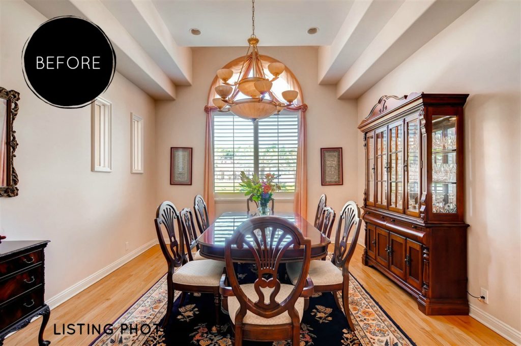
BEFORE - Rancho Santa Fe Dining Room

Above you see the dining room as we saw it the first day.  It was a very traditional room that just needed some simple tweaks to bring it up to today’s standards.

We started by replacing the flooring and painting the walls.  Then we removed the dated lighting fixture and drapery.
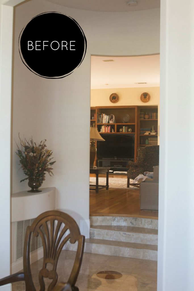
BEFORE - Rancho Santa Fe Dining Room

The picture above is from inside the formal dining room, looking back into the hallway and the family room.  If you missed seeing the makeover in the family room click here for full details and pictures.
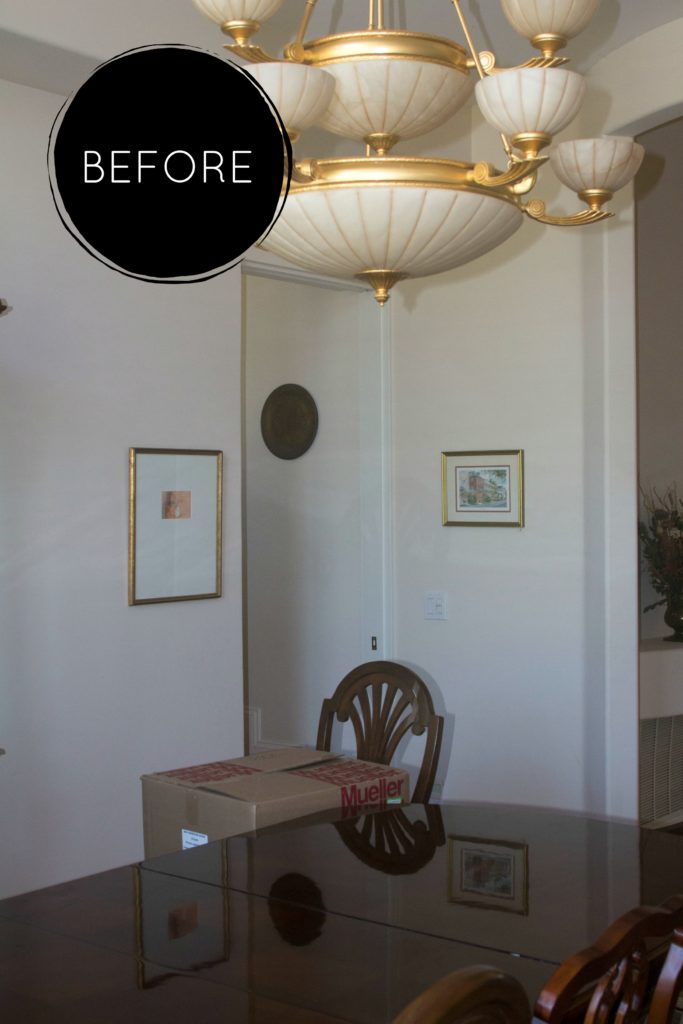
Before - Rancho Santa Fe Dining Room

Can you see it, that ‘special’ lighting fixture?  I’m sure it was ‘all that’ twenty-ish years ago, but we were happy for it to find a new home.

When you look to the left in the photo you will see the doorway that led to the kitchen.  We actually closed up this doorway to allow for more counter and cabinet space in the kitchen.  If you missed seeing the kitchen remodel simply click here for full details and photos.

AFTER - Rancho Santa Fe Dining Room

Ta-Dah – here is the formal dining room after we were done.  We brought in a new solid walnut dining room that seats ten.  A matching buffet was placed in the room which is ideal for serving and the bottom storage serves as storage for all bar accessories and liquor.

The owner was just telling me recently that they’ve received numerous compliments on the new chandelier which features amber colored crystals and an iridescent shade which is magical in the evening or when the morning sun comes through the windows.

The buffet lamps bounce light off of the antiqued glass vase and round wall mirror. The simple canvas ocean art is soothing while enjoying a quiet dinner.

Now lets talk about the powder room.  When I saw it for the first time I knew that was going to need some work.  You will see we literally took it from black to white . . . L I T E R A L L Y.

BEFORE - Rancho Santa Fe Powder Room

Black toilet, black sink, black silver and white foil wallpaper, it had to leave.   Yes, it was time for a makeover.

BEFORE - Rancho Santa Fe Powder Room

BEFORE - Rancho Santa Fe Powder Room

You will see the change of floor types between the hallway and the powder room, it was evident it needed to be changed.

Our first instinct was to have it match the hallway but we were unable to make that happen, so we went with the next best thing, Carrera Marble.  Be still my heart!

AFTER - Rancho Santa Fe Powder Room

This photo shows that we softened up the room by adding lots of white and gray.  The vanity is one that has been in my ‘want to use’ arsenal for several years, so it’s exciting to see it here in all it’s glory.  It’s hard to see, but those beautiful ring handles have crystals, fancy – fancy – fancy.

We are minus a piece of art above the toilet in this photo but I didn’t want to miss this chance to share this photo simply because of that small details.

AFTER - Rancho Santa Fe Powder Room

Inset floor tiles give you look of having an area rug.  There are actually three different tiles on that floor, the main tile, the border tile of the faux rug and the main tile of the faux rug.

The petite arched mirror, the wall sconces and the chandelier all add to the clean and fresh feeling of the powder room makeover.

Amazing how such a small powder room can make me so happy.

Now that you’ve seen this Formal Dining Room & Powder Room makeover’s what are your favorite parts.  I think it’s pretty evident what mine are.

Sharing is Caring

Facebooktwittergoogle_pluspinteresttumblrmail

The owner’s request, ‘create a bright, gray and white kitchen’.  “Mission Accomplished” with this Rancho Santa Fe remodel.

Overall, the footprint of the kitchen stayed the same.  There was no need to move plumbing lines which was a big bonus to the budget.

Although hard to see in this photo, to the far left you will see a door handle.  This was a large double door panty and just beyond that there are a couple of steps leading to the formal dining room.  That wall was closed up which allowed for more kitchen storage and counter space.

"Before" Rancho Santa Fe Home

The high-end stove, oven, and oven hood were items that we kept.  We did make a small change to the hood, can you see what it is?

The arched wall surrounding the kitchen nook, and the small wall just past the island were removed to make the space more open and user friendly.

There there is the kitchen nook which is beautifully sunny and bright.  Here we simply updated the window treatments, chandelier and brought in a cottage styled table and upholstered chairs from Universal Furniture.

Rancho Santa Fe Remodel - Susan Sutherlin Designs

So happy with this Sherwin Williams paint color.  Gray’s are so hard to find without looking ‘blue’ or depressing.  Perfection,  and it was used throughout the house.
Rancho Santa Fe Remodel - Susan Sutherlin Designs

A honed quartz was used on the island and a complimentary polished quartz was used on the surrounding counter-tops.

In the above picture you will see the area that was closed up giving the owners more work space and storage.

Rancho Santa Fe Remodel

Ta-Dah!  A finished bright gray and white kitchen with a splash of sunny bright yellow accessories, flowers and fruit. A very fun and rewarding Rancho Santa Fe remodel.

Again we layered the lighting which included recessed ceiling light, interior cabinet lights inn the upper cabinets and under cabinet lighting which in my opinion is a MUST for any kitchen.

Although difficult to see in this photo, the backsplash is a light gray chevron pattern which compliments the quart counter tops perfectly.

Rancho Santa Fe Remodel

Cordless roman shades allow all of the beautiful sun shine to flow through the windows each morning.   Take a look at how all of the patterns match up from one shade to another.  Thanks goes out to our wonderful work room for paying attention to this important detail (thanks Cathy).  Soon there will be a cliff top pool making the view even more rewarding.

The new lighting fixture was a must after our team found this treasure.  It’s rewarding to see it hanging there in all it’s glory.

Rancho Santa Fe Remodel - Susan Sutherlin Designs

We are very pleased with this new kitchen in this Rancho Santa Fe remodel, the heart of the home.  What is your favorite part?

Make sure to follow along with the BLOG to see the other rooms in this remodel.


Sharing is Caring

Facebooktwittergoogle_pluspinteresttumblrmail

This Rancho Santa Fe Family Room room is massive but the end goal was to share some of this room with the adjoining kitchen.  Mission accomplished during our remodeling process.

All of those arched walls were removed, and the kitchen and family room became an open living area.   See the ‘after’ shot.

IMG_3743 2 Before

Outside of the above sliding glass door is the future home of a swimming pool.  At night the view of Rancho Santa Fe is stunning from this side of the house.  To maximize this feature, we greatly increased the width of that sliding glass door.

IMG_3751 2 Before

IMG_3752 2 Before

It was decided to demo this built-in entertainment unit and replacement it with a new, and much larger unit.

The fireplace and the recessed area to its right, was lost in favor of a double entry from the living room.

104_14888 Las Mananas

Ta – Dah!  A new family room for this growing family.

New wood floors continued from the living room into this Rancho Santa Fe family room.

A custom built-in entertainment unit with a bowed front was created and one of my favorite updates of this remodel. Look closely, you’ll see that we built in the various speakers in the upper portion of this unit.

All of the upholstered furniture was custom made which included the twelve foot sectional.

Notice that the wall behind the sofa and around the breakfast nook is gone.  It made a huge and positive improvement to the flow and use of these rooms.

We layered all of the lighting.  What does that mean?  Well, we started with installing recessed ceiling lighting, then we had lighting installed in the entertainment unit and finished with table lamps.  Layering lighting is put into varying heights in a room and is really a must for an intimate feeling.

Why have one sofa table when you can have two.  With such a large sectional we doubled up on these tables which was ideal for a couple more table lamps, but remember you’ll need electrical outlets installed in the floor when ‘floating’  lighting fixture in the middle of a room.

105_14888 Las Mananas

106_14888 Las Mananas

The new bench seat is normally something you might see at the base of a bed but is also perfect when planning on extra seating or a way to divide a room. The low profile of this piece it enables easy television viewing and is fantastic for entertaining.

Now for the surprise, spend a minute looking around the room and think about where we might have hidden something.  Did you find it?

Behind the new entertainment unit there is a small room which enables all of the mechanics of the entertainment units to be hidden.  I’ll leave it to your imagination as to how this area is accessed.

So what are your thoughts about this new Rancho Santa Fe family room?  I would love to hear your thoughts.

Sharing is Caring

Facebooktwittergoogle_pluspinteresttumblrmail