The time has come . . . the time to share one of our personal bathroom remodels.
I’m working with a couple of clients on their bathroom remodels and they have asked to see what we’ve done in our own home. Hang onto your hats! I can’t promise that you won’t feel the need for a pair of gloves and some hand sanitizer after seeing these “Before” shots.
Here we go . . .

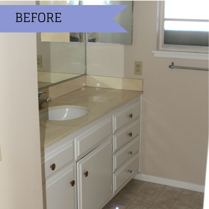
This is what the guest bathroom looked like when we purchased the home . . . scary! Can you see the layers of dirt on the floor, counter tops and around the light switch?

I hope you are laughing out loud just about now, we certainly were when we toured the house the first time. I’m sure this was quite the look in the 60’s when the house was built, but it had run it’s time in the spot light, unless of course you wanted to hang a disco ball.
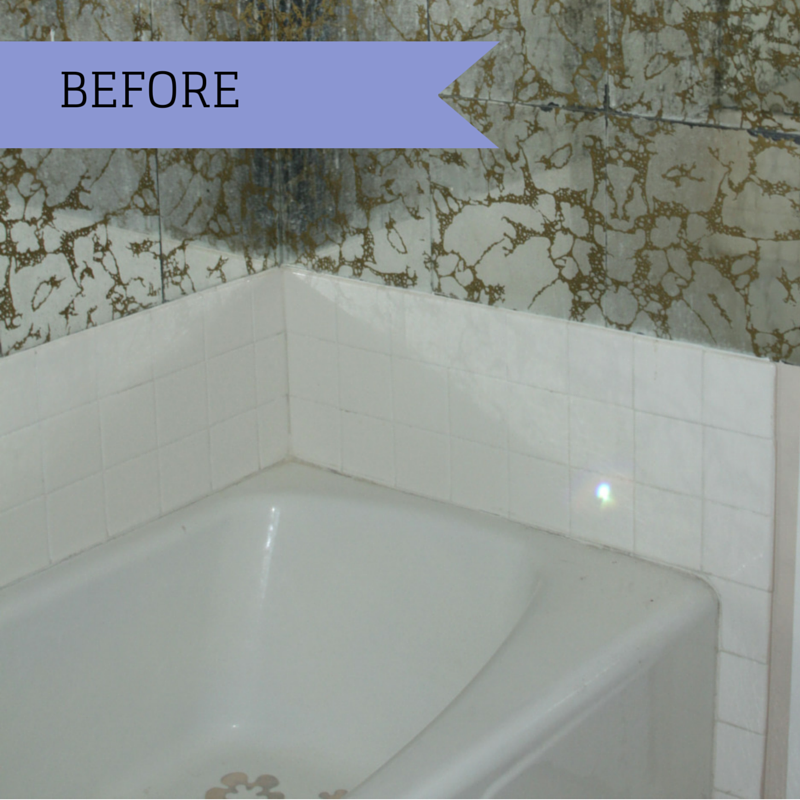
Aren’t you loving that marbled glass tile surrounding the tub/shower? That “beautiful” tile was on all three walls and went all the way up to the ceiling. Having this surround the entire tub seemed like it came with all sorts of safety issues.

You can just tell by the dirt that it had been awhile since someone lived or bathed in this house . . . thank goodness.


Just three months later we had this comfortable new shower where once the marbled glass tiles graced the walls.
My favorite parts of this shower are the tile and the light. My husband’s favorite feature is the ceiling rain shower head.

I must say, our contractor and his team of professionals did a great job on our remodel. On one of our many stops at the house to look at the progress of the changes, we noticed that the tile was not being installed the way that I had designed. They quickly ripped it out and re-installed it the way that we had planned. As I’ve said before, frequent stops by your construction site are vital.
The brown tiles that are inset on the bottom floor of the shower work beautifully with the tiles that are on the back splash of the bathroom vanity (see photo near the top of this post).

For the clients that have worked with me, you know I’m big on having the “cubby” for all of the shower necessities (ie – shampoo, shavers, soap), out of view when you enter the bathroom. You will see this “cubby” to the right in the photo above. There’s just no need to see all of those various neon colored bottles popping out at you when you walk into the bathroom, un-needed eye clutter.

Here you can see a good shot of the ceiling rain shower head and light. I can’t even think about doing another bathroom without including that light. It comes in handy when shaving legs, cleaning, and making the bathroom seem larger. Light is a highly under-rated design tool.

Our Wave Wall, it makes us happy, especially my husband who loves the beach. These tiles are only on the back wall of our shower and truly make a statement. These tiles measure 24″ x 24″ which means less grout, which means less cleaning issues. So many reasons to make me smile.
I’ve purposely not shown you the window or the potty area of the bathroom remodel because I’m still lacking window treatments and art. Once I get a chance to get those items created, ordered and hung, I’ll make sure to post more photos.
Hope you enjoyed this small glimpse into our “new” home. Leave me a note, I love hearing from all of you.


.png)
.png)


Masilu - Lighter colors open up a room, make them appaer lighter and bigger. Choosing a color you like might depend upon the size, number of windows and what you will use the room for. Stripes going up and down in a small room also make it appaer bigger because your eye goes up the stripes and gives the illusion of taller ceilings. That kind of thing! More brown paint sounds like you would have a very dark house!!! You can even go to your local True Value hardware store and they will match paint to material you might be using in the room etc so that everything compliments each other.