Let me tell you it’s been a busy week! In the last two days we’ve finished two different installations, brought a new client aboard (welcome to our “family”) and have been busy preparing for the Las Vegas Market (furniture and accessories) this next week. I’m not kidding about those roller skates, I think I’ll get a pair for Christmas.
Any how, among the fun things I did this week was to tour the Coastal Living Magazines design home with a great group of designer friends. Here is peak at a few of the things we saw in the general areas of this open, bright and cheery beach home.

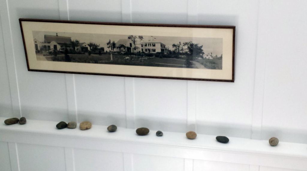
Hallway Shelf & HIstory Lesson
When you’re leaving the main floor and heading down to the basement (never thought I would say “basement” about a house in Southern California), you see this ledge where there are a few collected rocks and what appears to be a picture of the house as it was “back in the day”.

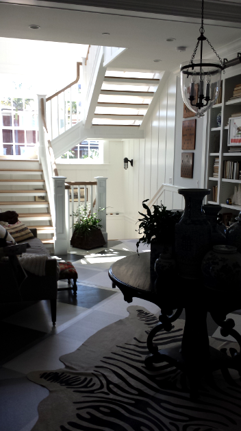
Brightest Staircase Ever
One you enter the house, and pass the small office, you come to this area where you turn to your left and see this beautifully bright staircase. It’s so happy with sunlight.

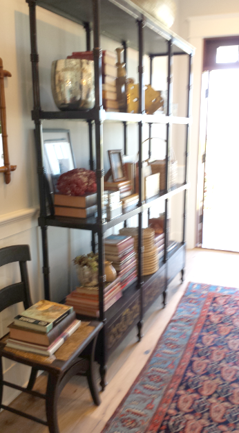
Hallway Library
Please forgive the blurriness of this picture (above), I was trying to shoot quickly with my phone before I got a “talk’n to”. When you walk through the front door, which is behind me, you walk straight forward and see the view of ocean. It’s just to the right of this bookcase, where the light is flooding in. I could see walking right by here, grabbing a book and heading out to the back porch for a relaxing afternoon. (No roller skates needed.)

Painted Floor & Transitions
Now this is where the yin and yang meet. There were painted oak floors as you entered, which gave you the beach vibe. Then there was stained oak floor continuing throughout the remainder of the house. On top of the stained floors you have an oriental influenced rug to the left and a animal print to the right.
Another thing all of us discriminating designers thought was interesting were the books in these white built ins, they were all turned around. What was great was to see the color and texture of the pages, but for practicality reasons we were wondering how you would find a book.

Transom Windows Throughout
I have a big love for Transom windows. You don’t see many of them here in Southern California, but they would be on my top ten if I were building a house. In my opinion they allow the room to feel more open and also bring more light into a room.
Take a peak out that door you will see a bunch of framed maps, along with a few others tied up in the basket. They were beautifully coordinated in color and would be a great addition to an office or guest room.

This utility sink (above) in the laundry room is such a nice addition. A place to wash the dog, work with your cleaning supplies, or to wash off your beach toys. Yep, that’s another top ten.

Laundry Room Storage
I like this laundry room tile (above) but it got rather busy when used in such a large amount. Maybe it could have been better used as a border. What was a nice finishing touch in this room where the creamy green vintage knobs . . . can you see them down in the corner?
Again, drop me a note and let me know what you think of this house. I really would love to hear your thoughts.


Mido - Ink blue is the color of the trim in my kitchen. We made the dciseion in 1983. Yes, I am THAT old. Do you think we were ahead of the curve? My husband and I designed our house, and he and his brother built it. We had no children at the time so this was our baby. We spent evening after evening on the couch with color charts in our laps. It was such a simple time. I adore my home…. still. Our children are now grown with lives of their own. My husband has a rare degenerative brain disease, so I cherish the memories that come flooding back when I see posts like yours….Thank you