I feel as if I must apologize for the pictures you are about to see, the “before” pictures of the house before we bought it. It was horrible! We knew we wanted a “project”, but this room took the cake, it was the worst room in the house, or did I say that about the last bathroom. I’m sure our Realtor thought we were nuts when we decided to make an offer on this home.
Here we go . . .
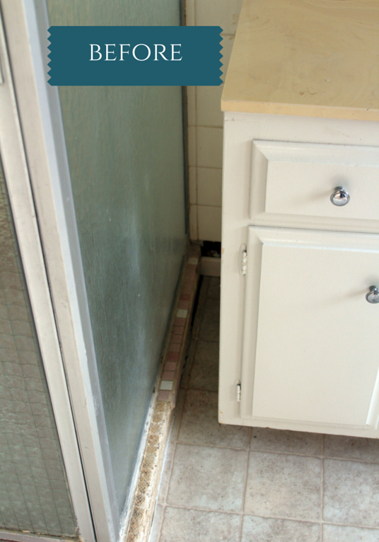
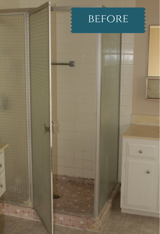
Take a look at that shower, can you see the tiles popping off everywhere? We still can’t figure out why there was a space left between the shower and the vanity.

This picture (above) just gives me the creepy-crawlies . . . just the mold alone was enough to make most run. During our remodeling process we did take this room down to the studs so that mold is H I S T O R Y!

To the left of the original shower there was a small make-up area. In the “after” photos you will see that this area became part of the grand shower.

We kept the new vanity in the same location as the old white one. We saved a “little” on the plumbing by being able to make this compromise. When remodeling rooms with plumbing, this should be a major budget consideration.

It’s the bars on the windows that got me. Needless to say they are no longer there and there is also an entirely new window.
I’ve never seen an electrical switch over a toilet, still trying to figure that out.
Now onto the new bathroom, take a big cleansing breath, you made it through the yuck!

When looking in the door (which we moved to the right), the shower now takes up the entire wall to the left. It’s a great area which we are very thankful to have.

Can’t see it in this picture (above), but there are no more bars on the windows. A good thing!
I should also mention that we also installed all new baseboards and crown molding throughout the house. Amazing how just that simple addition can dress up just about any room.

We kept the same cabinetry and hardware throughout the house, and we continue to be happy with our decision.

Here you can see the pony wall in between the shower and the vanity. Just on the other side of that pony wall is another one of those “cubbies” that I love. This cubbie is storage for the necessities you need in the shower (ie., shampoo, conditioner, razor).
We should also talk about lighting while were here. In the bathroom where you need to get up close and personal (ie., make-up application, etc.), it is very beneficial to to have overhead lighting and lighting on either side of the mirror. If you just have overhead lighting your forehead will cast a shadow on your eyes.
We’ve also put lighting in this shower, just like the shower in the guest bath. This should be a must on everyone’s bathroom remodel list.

Here (above) is a close-up of the tile we selected. Large format 12 x 24 size, we stacked them in a straight pattern for a more modern look.

We’re very happy with how well the counter top works with all of the various tiles.
What is not shown in these photos are the very large unit to the right of the door when you enter the bathroom. This is a great storage area for so many things.
The other thing, is a full length built in mirror on the back of the bathroom door. Another investment that was worth every penny.

Every house needs fresh flowers, they just make you smile.
Hope you enjoyed this tour. I’ll bring you back to this room when I have a chance to dream up a window treatment . . . to busy working on clients rooms right now.


.png)


Gail Nunn - This looks so great…we are so happy for you, Susan, that you have been able to use your creativity with such rewarding results. Hats off to you!