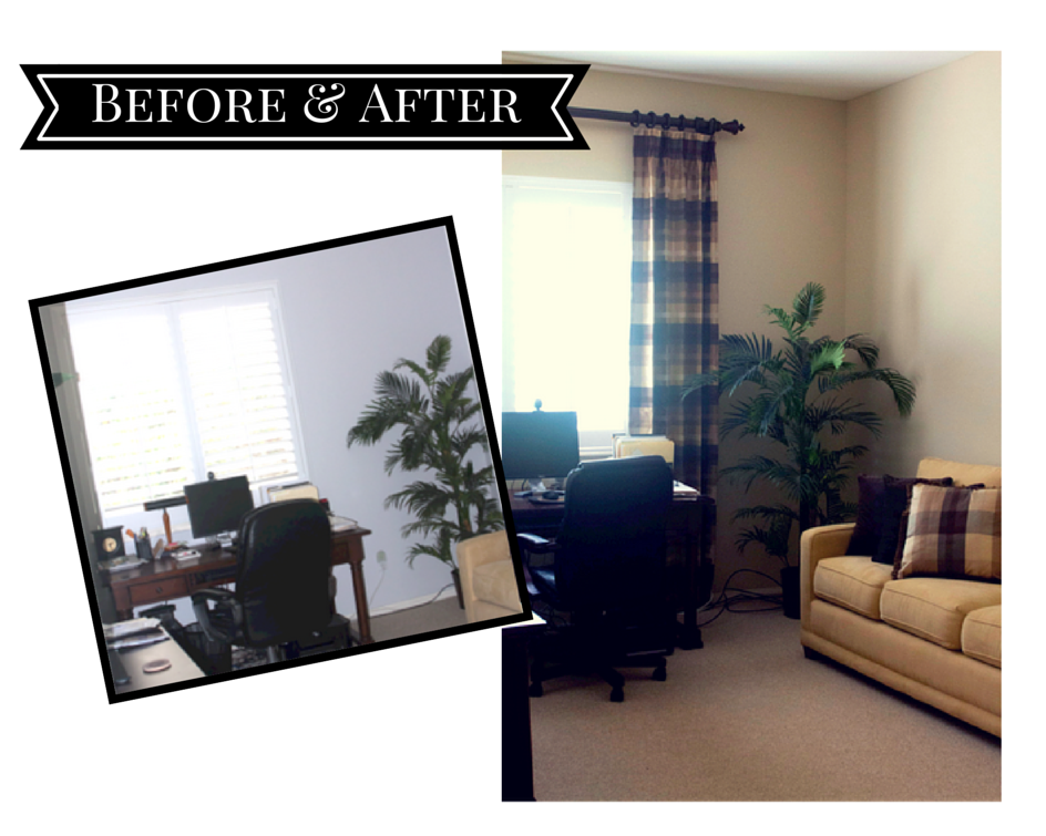
Here is a quick continuation of the post from yesterday. This is a small adjoining sitting room and office to Maryann and Craig’s master bedroom.
When I first met with Maryann she wanted this room to feel a little cozier and more like a retreat where she could have some quiet time.
I immediately suggested we add drapery panels to the windows, add some patterned pillows to the sofa, change out the dated recliner, shop for some new art, bring in some chair side lighting, and last but not least add a small table next to the new recliner.
The drapery panels we added are perfect! They are silk and in the same tones of the adjoining Master Bedroom. You will notice that the wood rod we added is mounted higher than than window to make the window and ceiling look taller, a “trick” nearly everyone could use. Also, the drapery panels are non-functional, meaning they are there just for aesthetics. The panels are hung just at the side edges of the window, this allows for all of the benefit of the window light and gives the appearance of the window being wider.

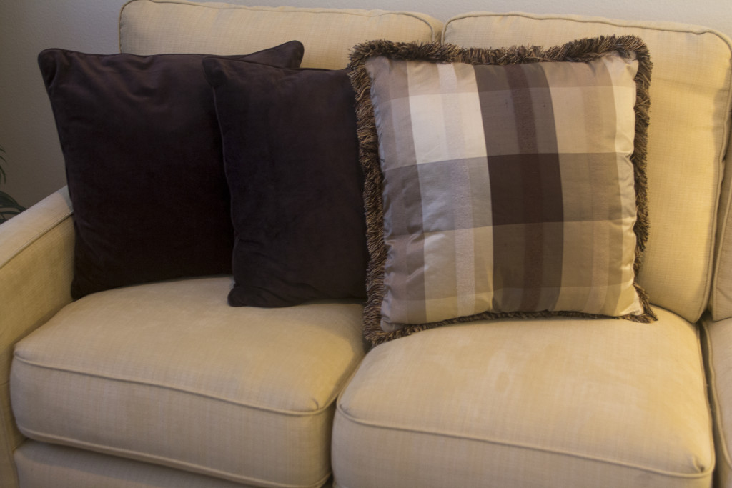
Added Pillow – Compliment New Drapery Panels
We added a simple pillow to the existing sofa to coordinate with the window treatments. It also has some fun multi-colored brushed fringe.

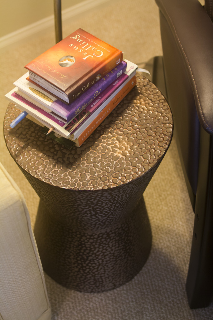
Table Shape
Check out the shape of the small chair side table, it’s perfect with the lamp that sits directly behind the table.

Table Texture

New Floor Lamp
Had to share with you a close up of the new chair side floor lamp. It’s so unique, it has a metal outer shade with an interior shade made of textured velum. It’s really the icing on the cake in this new hideaway.


.jpg)
.jpg)


