


![]()
If you are looking for a way to quickly, and inexpensively, change a room, then paint is your answer.
For years Pottery Barn has published their favorite paint colors so I thought I would go through and highlight MY top nine among their choices. See my great BIG green checks for my go-to color choices.
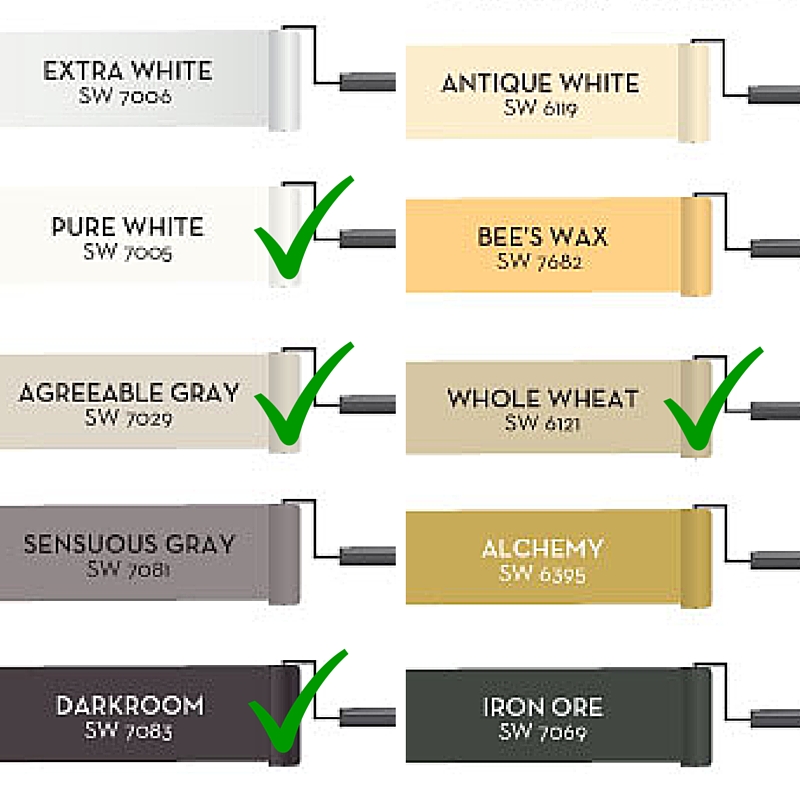

Sherwin Williams Pure White paint color has always been a favorite and something I always recommend for baseboards and doors. It looks so fresh in this back door entrance area. On a side, I’m loving that French door . . . it’s on my ‘some day’ list.
If I had to pick the ‘go to’ paint color of 2015, it’s Agreeable Gray. There are very few homes that this color doesn’t look great in, especially paired with Pure White and any other shade of gray and black.
Here we see the color Whole Wheat, although I think it’s loosing it’s steam as we near 2016, it’s such a warm cuddly color, I have a lighter shade of this same color in my own home.
Go bold or go home! The color Darkroom is fun! I’m big on making a statement in a powder room and this color would be fantastic! I say go for it and use lots of stainless steel and white to bounce off of this unexpected paint choice. But please, make sure to use a non-shiny finish, shine will make you wish you hadn’t selected this dark tone.
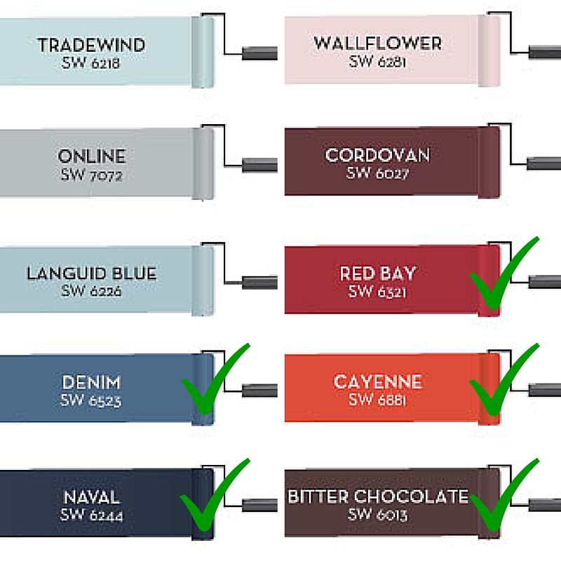
I’ve used the color Red Bay numerous times and it’s never let me down. This particular red that has a lot of black in it, something like this should be your go to for a red.
This is like the color Red Bay and Orange got together and had a baby and they named their newborn Cayenne. It’s purdy and spicy!
Yep, this is another one of those 2015 favorites . . . big time! I actually have two walls of my studio painted in this color and am presently using it in an Encinatas beach house we are designing. I love it!
Bittersweet Chocolate, yes please. Look how great it works here in this beach front estate, but it could just as easily go into a mountain cabin retreat.
Remember – when picking any color of paint, purchase at least three colors and paint a large sample on the walls. Look at them in daylight and evening light, you will be amazed at how much they change in your own home and in the change of light.
Leave me a comment and let me know your favorite paint colors.
.png)
.jpg)
.png)